SCG Can Make You Mobile!
- By admin
- 0 Comments

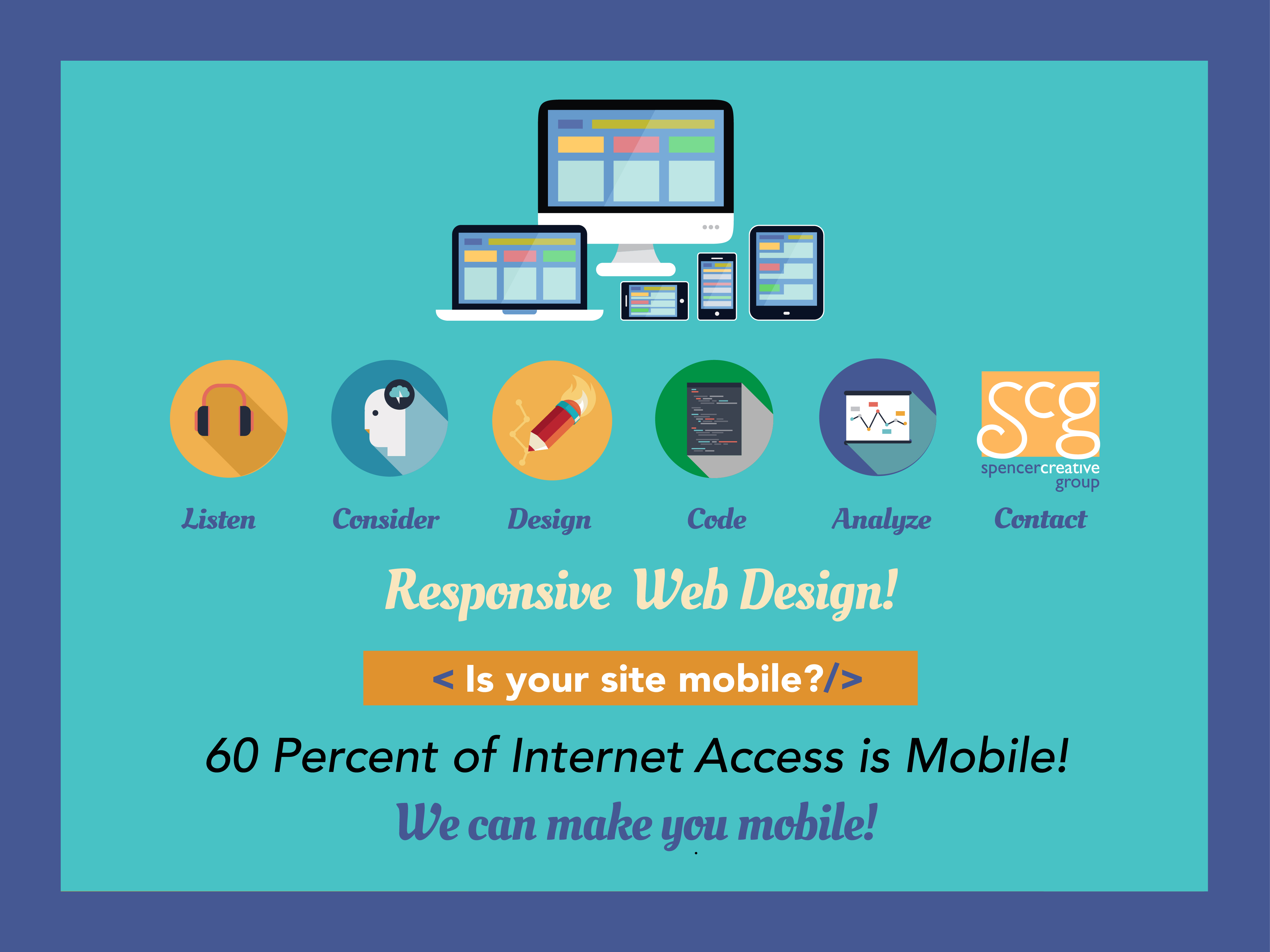
Think mobile first!
60 percent of internet access today is mobile. SCG is designing responsive websites.
A responsive website has the ability to display on a wide range of devices, from desktop to laptop, to smart phone or tablet, with minimal scrolling and optimal viewing.
Update: 11/3 /14–Just launched
http://erpexecs.com
We created this site for ERP Resource Professionals. It is truly responsive and I am very proud of it. I designed it and Mark Tothill developed it.
Some interesting statistics on mobile:
• In 2012 75% of Consumers wanted mobile-friendly sites
• Mobile opens have increased by 400% since 2011
• Over 50 %of emails are opened on a phone
• 55% of mobile customers are ready to purchase within an hour
• 83% purchase within a day
• Mobile customers visit a site an average of 6X
• Mobile customers have spent an average of 15 hours researching on their phones
• 35% of people go online only via mobile
Below is an excellent example of a responsive website designed and developed by our programming partner Big Ripple Multimedia. Take a moment and use your mouse to see how it automatically responds to tablet and phone size.
SCG has 2 more responsive websites in the works. I will post them very soon.
And in the true fashion of the cobbler‘s children going shoeless, I will be redesigning my SCG site to be truly responsive this Fall.
Stay tuned and consider taking advantage of our 10% Off offer.
SCG can make you mobile!
Call or Click
914 273.9517
info@spencercreativegroup.com
https://spencercreativegroup.com