Design Trends 2018
- By admin
- 0 Comments
- Design Trends
Every year at about this time, the new design trends are predicted. This year everything old is new! Which is kind of a good thing.
These trends include gradients (which we have not seen for years) but now in brighter colors. Cool! Serif fonts are back! Wow! They have been gone a long time! Vintage! (I love!!!) 80s and 90s color palettes! More authentic photography. (Goodbye smiling, beautiful people!) There will be more print-like design and layouts on the web. And flat design which has been popular for long is falling out of favor. I, for one am tired of that trend.
Very exciting! I can’t wait to get to work!
Here is a list of the top 10 design trends (web and print) for 2018.
1. Responsive logos
2. Gradients
3. Shadows
3. Duotones
4. 80’s & 90’s Color Palettes & Patterns
5. Movement: animations & GIFs
6. Bold Typography
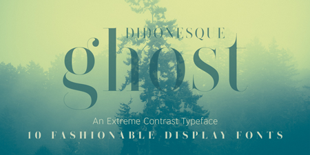
7. Serif Typography
8. Original Graphics and Illustration
9. Authentic Photography
10. Detailed Vintage
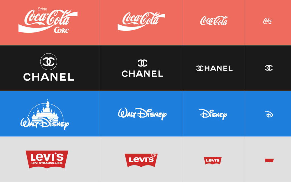
1. Responsive Logos
Responsive design has been with us for about 10 years. Search on phones passed search on desktop several years ago. Logos, once designed in one sacrosanct format must now be adaptable to viewing on various size devices—most importantly mobile, and must work well on screens as small as 4.7 x 2.64 inches. Hence, the emergence of responsive logos.
These logos do exactly what graphic designers are trained to do. They take an idea down to it’s most iconic and essential elements.
2. Gradients
We used lots of gradients in the early part of the 21st century. And now they are back and brighter than ever! A very modern change to a worthwhile design element.
3. Shadows
I love shadows and I am glad they are back. Shadows lost popularity with the move away from visual realism and as extreme minimalism became popular. Designers did use very graphic “long shadows” on flat design. But Google has re-introduced “real” shadows and the ability to add depth to a design is back. In addition, adding shadows helps the viewer understand the visual hierarchy. The updated new shadows are soft and realistic, not the hard-edged drop shadows of the past.
3. Duotones
Another great technique from print design. But again wild, and brighter for 2018. This is a cool and tricky technique, requiring a Photoshop pro. A duotone is an image where two halftones are printed on top of each other in contrasting colors. Often the dot pattern (from print) was used as part of the design. This technique has taken on new life with digital imaging programs. And Spotify may be credited with reviving the trend. Very Andy Warhol. Duotones are likely to be one of the major trends of 2018. I like it! (But should be used in moderation…)
4. 80’s and 90’s Color Palettes and Patterns
They used a lot of pink and blue back in the day. Pink and blue are two of my favorite colors but easily overdosed on. I would be moderate with this trend. This is really a “design trend” as opposed to an example of “design style,” which is usually long-lasting and sometimes timeless.
5. Movement: Animations & GIFs
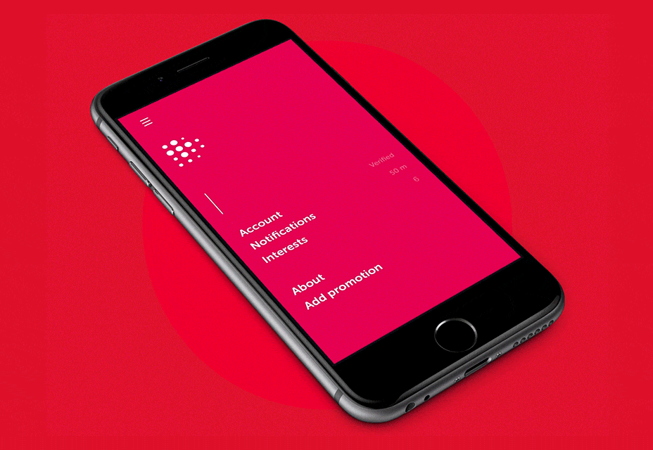
What is a microinteraction? It’s just a little bit of movement that catches the eye. These micro-animations are often used to explain usage how to perform tasks to users. The gif below is another example of one of the year’s hot colors—pink!
6. Bold (and big) Typography
I love typography. Love to type is one of the reasons I went into design. There are just too many good examples of type to show only one here, so here is a link to some nice examples. https://www.templatemonster.com/blog/top-10-typography-trends-2018/ There are many variations form bold typography to large typography, to animated to typography, clean sans serif type is still popular and the return of our next design trend, serif typography!
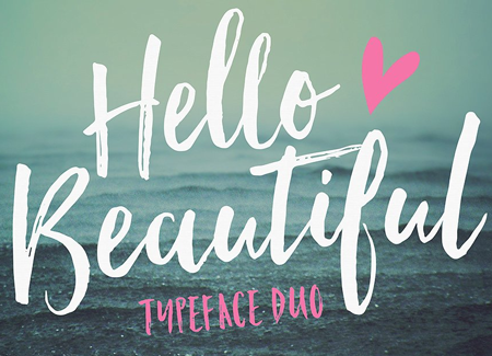
7. Serif Typography
What is a serif? Serifs are is the little “feet” on the bottom of serif letterforms.The serif’s job is to lead the eye from one letter to the next, to make reading easier. For about the last decade, sans serif type (“sans” is French for “without”), or type without serifs has dominated the minimalist design landscape. Serif type has traditionally been used in “important” document or documents that require a lot of reading, for example, newspapers (The New York Times online and print editions use a serif font, most books, and academic works. Serif type is also often more decorative than san serif type. An example is below.
8. Original Graphics and Illustration
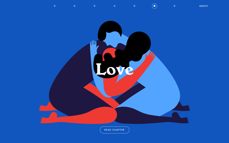
Over the last decade (or two), the availability and low-cost factor of stock images and photography have greatly decreased the use of custom created art. Today, people are so inundated with visuals, and so aware of and perhaps jaded by stock art, that custom art, which provides real relevance to the subject matter, is making a comeback. This is great for the art community and for readers as well! A good trend! This Matisse inspired illustration features minimal animation and is from an interesting site called https://insidethehead.co/chapters#age
9. Authentic Photography
Authentic is a big buzzword these days. Brands and people both want to be more “authentic.” So what is authentic photography? It is a photograph that captures a moment, that is not posed, and is not highly retouched or uses filters such as those in Photoshop or Instagram. It’s a real, good, old-fashioned image that captures a special or significant moment—without digital help.

10. Detailed Vintage
Vintage. I love vintage. This is a good year of design trends to me! I often have to discipline myself to steer clear of vintage, but now it’s back! Beautiful details, gorgeous typography, very custom feeling. I love clean design but I am crazy about vintage.
You can see more design trends for 2018, such as
- Doubles
- Illustrations over photos
- Chaotic Typography
- Typography with photo elements
- Negative Space
- Double Exposures
- The Ruined Effect
at these inspirational blogs—
99Design’s inspirational 2018 graphic design trends post, Graphic Mama’s graphicmama.com/blog/graphic-design-trends-2018/ and JustCreative’s http://justcreative.com/2017/11/28/graphic-design-trends-2018/
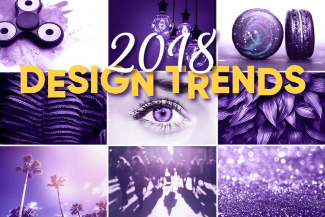
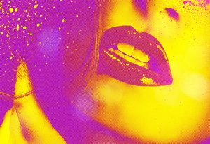
Note: The image at the top of the post is in Pantone’s Color of the Year, Ultra Violet, and features chaotic typography.
How do these to these design trends and conventions affect your brand?
For professional digital marketing, a new logo or website, call SCG.
914 273-9517 • info@spencercreativegroup.com
About the Author
Karen Spencer is a digital marketer and design evangelist who provides web design and graphic design solutions. Karen believes that good design isn’t pretty—good design solves a problem.
In today’s digital marketing environment, your website has to work harder than ever to bring you leads and convert visitors to happy clients.
Spencer Creative Group is a Westchester County design firm, located in New Rochelle, New York. SCG specializes in design for the medical, financial industries as well as design for higher education and not-for-profits.